How To Add A Page In WordPress
It is critical that your website is up to date with the latest information and…
More details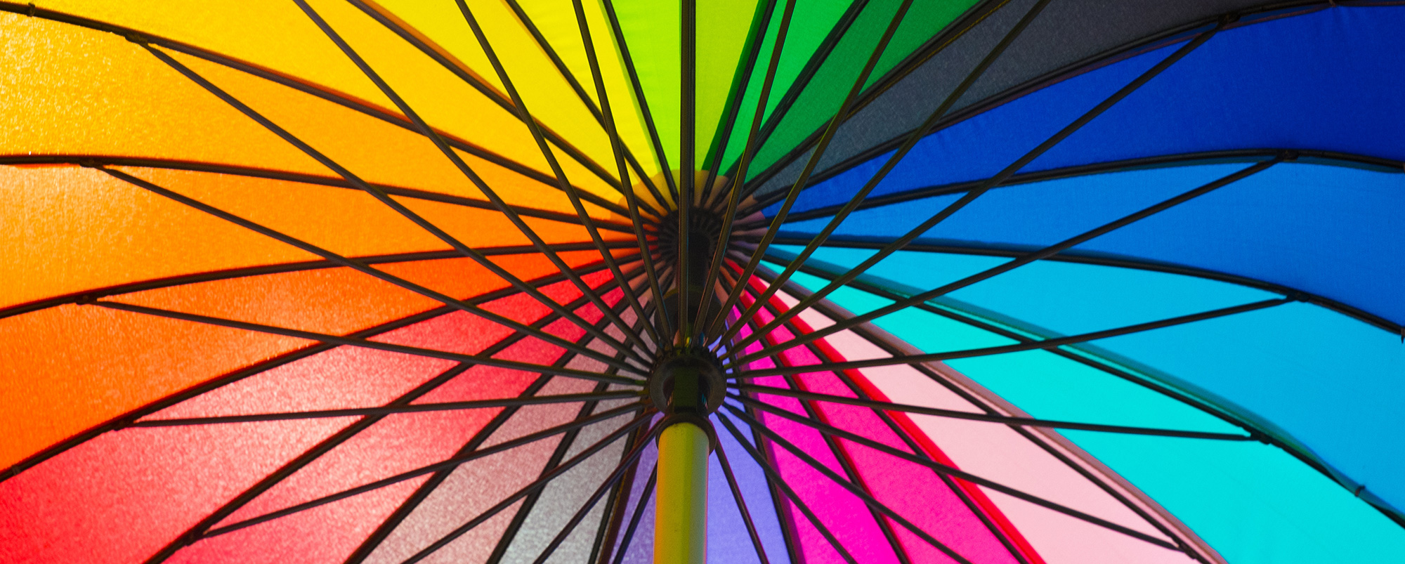
Share this post:
Array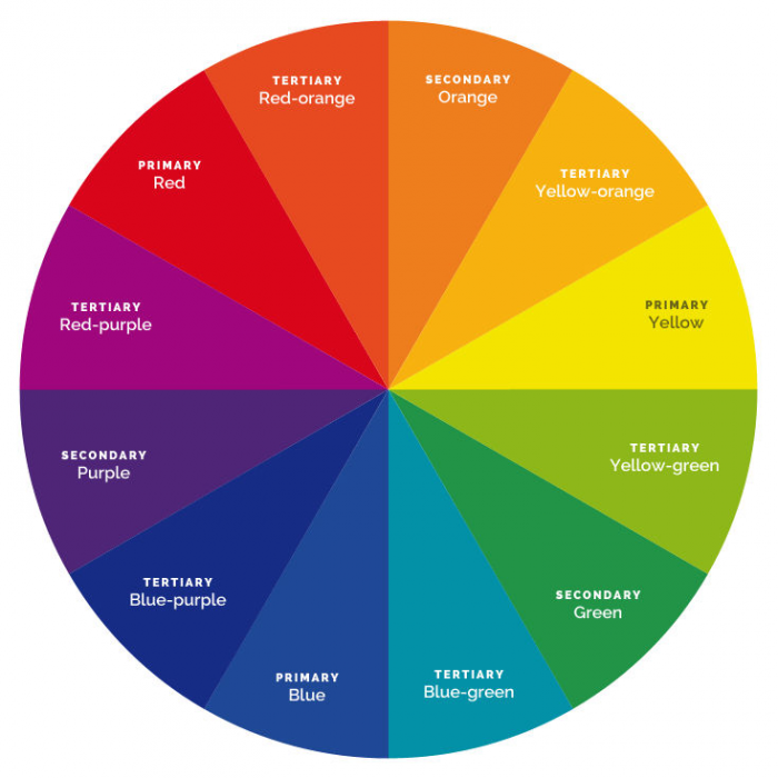
Ahhh the meaning of colour – this is a complex animal with different colours meaning different things to different people.
Each colour has both positive and negative meanings attached to them. Because of this it’s impossible to determine how a single colour will be perceived. You need context and, more importantly, other colours to create a theme with the power to invoke an emotional response from the viewer.
Look, it’s our friend the colour wheel:
Primary subtractive colours are a set of three that cannot be created by mixing others colours together. These colours are:
Secondary colours are created when equal quantities of two primary colours are mixed together. These colours are:
Tertiary colours are all the colours that appear between primary and secondary colours on the colour wheel. As well as these base sets, colour can be grouped into two sub-sets that offer different psychological responses when viewed.
Warm Colours: These are red, orange, yellow and red-purple, plus various combinations of these colours.
Warm colours convey: Heat, daytime, fire, passion, happiness, enthusiasm, energy and positivity.
Cool Colours: Cool colours are green, blue, purple and yellow-green, plus various combinations of these colours.
Cool colours convey: Cold, night, water, nature, calm, survival, relaxation, reserve, professionalism and the environment.
Neutral Colours: Colours such as black, grey, white, brown, beige and cream are referred to as neutral colours.
In web design neutral colours should always be used as part of a chosen colour scheme as without them a website can be overly stimulating and hard on the eye. They are often used as a backdrop. Black is the strongest of the neutral colours and works well in both traditional and modern design. In its purest form it can be overly dominant, oppressive and deaden a design. Instead of using pure black it’s recommended that a small amount of a warm or cool colour is added. On the other end of the scale is white. Unlike black white doesn’t dominate other colours and allows them to take centre stage.
Given the intense colours used in their branding we created a vibrant and eye-catching website, without being overwhelming. This was carried out by toning down the vibrant and energetic colours used with a neutral dark grey background. This evokes a feeling of energy and dominance.
With a brief to use a lot of blue across the website we have ensured this is not too dominating braking it up with a contrasting menu and well-spaced imagery. This ensures that the site carries the desired theme as requested by the client, with enough life through the page to keep the visitor engaged.
This website uses a combination of colours in the images used to convey an energetic and happy vibe. However, the blue in the branding also conveys a feeling of professionalism. This use of colour works perfectly for the primary school sector.

It is critical that your website is up to date with the latest information and…
More details
When designing a website, you may get a variety of answers to the question “Who…
More details